Art Gallery Labels Made Easy
Expert Tips & Ready-to-Use Examples

Most viewers spend just 10-15 seconds reading art gallery labels. This brief window is your chance to create a meaningful connection between your artwork and its audience.
These small but powerful art labels serve beyond simple identification. They build essential bridges between artists and viewers, enhance the exhibition experience and drive sales. Art gallery labels can improve viewers’ understanding and appreciation by a lot when you format them with 14-point fonts and consistent styling.
This piece will help you craft perfect art gallery labels. You’ll learn the basics like artist names and medium details. We’ll also share practical templates and placement tips to create labels that complement your artwork and engage your audience.
Want to change your gallery’s presentation? Let’s head over to everything about creating professional art labels that work.
Understanding Art Gallery Labels: Purpose and Importance
Art gallery labels act as silent storytellers that build vital connections between artists, artwork, and audiences. Studies reveal that detailed labels make visitors spend substantially more time viewing each artwork and report more positive emotional responses.
What makes an effective art label?
The best art labels answer visitors’ unspoken questions and create emotional bonds with them. They blend three key elements: familiarity, focus, and visualization. Labels work best when they connect with viewers through familiar territory and show new views that let them draw their own conclusions about the artwork.
A good label has the artist’s name, artwork title, creation date, medium/materials, dimensions, and the artwork’s history. The labels should maintain a consistent structure throughout the exhibition to create a reliable pattern for viewers.

How labels improve viewer experience
Research shows that descriptive labels substantially boost visitor interaction with art. Viewers who get detailed information show physical signs of excitement—their pupils dilate and skin electrodermal activity increases—compared to those who see simple labels. These visitors also understand the artwork better and feel less negative emotions when they look at it.
Well-written labels bring back the context that artwork loses in gallery settings. They show each piece’s significance and its role in the exhibition’s story, making art available to different audiences.

Common mistakes to avoid
These common mistakes can hurt gallery labels’ effectiveness:
- Forcing too much information into limited space – This creates dense, difficult-to-parse sentences
- Using “artspeak” and jargon – Technical language can alienate viewers unfamiliar with art world concepts
- Patronizing the audience – Over-simplifying or “dumbing down” content can feel condescending
- Unfinished narratives – Beginning stories without proper conclusions leaves viewers confused
- Poor placement – Labels should be positioned consistently between eye-level (150cm) and a lower height (1m)
The best approach is to create labels with clear language that provides context without overwhelming viewers. An ideal label uses about 70-80 words for individual artwork descriptions and 100-200 words for introductory panels.
Essential Elements of Professional Artwork Labels
Art gallery labels need specific elements that tell viewers key details about each piece. These elements work together and help audiences better understand the artwork they see.
1. Artist information: Name, dates, and credentials
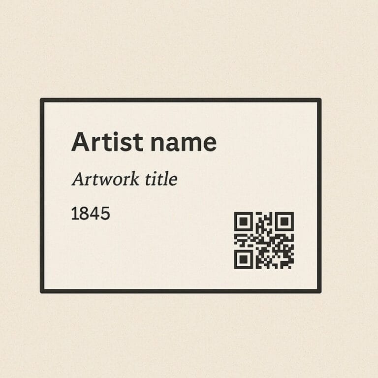
The artist’s name stands out as the key identifier on art gallery labels. Labels show birth years for living artists like “Jane Smith, b. 1985”. They display both birth and death years for deceased artists such as “Frida Kahlo, 1907-1954”. The artist’s nationality adds context about their background. Relevant credentials show the artist’s expertise or importance in the art world. This information appears at the top of the label and establishes the artwork’s origin.
2. Artwork details: Title, medium, and dimensions
The artwork’s title stands out in bold or italics from other details. The creation year follows right after the title. Medium descriptions range from basic (“oil on canvas”) to complex (“gel medium, tea, sand, dirt, grass on found canvas”), based on the artwork. Labels show dimensions in a standard format: height × width × depth (if needed), usually in inches or centimeters. Some works might say “dimensions variable” if they change.
3. Pricing and availability information
Commercial galleries put prices on art labels to build trust with potential buyers. The price sits at the bottom of the label, easy to spot yet subtle. Labels might show “NFS” (Not For Sale) for unavailable works. They could also credit lenders with “Courtesy of XYZ Collection”. A complete price listing helps viewers feel confident about making purchases.
4. QR codes and digital extensions
QR codes on labels create ways to learn more about the art. Scanning these codes takes visitors to the artist’s website, portfolio, or buying options. Museums and galleries link QR codes to videos, audio descriptions, and AR experiences without taking up wall space. These codes help visitors with visual impairments by connecting them to audio recordings. Electronic paper displays are becoming a smart choice over regular labels, letting galleries update information and change languages quickly.
Step-by-Step Guide to Creating Art Gallery Labels
Professional art gallery labels can be created without expensive equipment or specialized knowledge. A good grasp of simple techniques will help you craft museum-quality labels quickly.
1. Choosing the right materials
The right high-quality materials should complement your artwork without overpowering it. Professional galleries typically use:
- Heavy cardstock (65# cover stock or heavier) that runs smoothly through standard printers
- Foam board backing that adds polish with a subtle three-dimensional effect


2. Formatting text for maximum readability
The text formatting must be clear and easy to read:
- Text size should be at least 14 points so visitors can read labels easily
- Spacing and margins between text elements need consistency
- Artist names in bold and artwork titles in italics help distinguish information visually
- Labels should be cropped close without extra margins
Clean, simple fonts on white or cream backgrounds create maximum contrast. Most gallery lighting conditions work best with black text on light backgrounds.
3. Placement and installation best practices
Label placement shapes how visitors interact with your exhibition:
- Labels work best between eye level (150cm) and 1m from the floor
- Label height should stay consistent throughout the exhibition
- Artwork labels belong to the right or beneath the piece
- A level ensures labels stay parallel to the floor
Museum professionals recommend several adhesive options. Temporary displays benefit from simple masking tape rolls with open ends at top and bottom. Fun-Tak or 3M foam mounting squares offer secure adhesion that won’t damage walls. Month-long exhibitions often use double-sided tape dispensers like Bic tape for heavier labels.

Ready-to-Use Art Label Templates for Different Settings
The right templates help you save time when you create professional art gallery labels. Ready-made templates give you consistent formatting that works well in different exhibition spaces.
Gallery exhibition templates
Clean, minimal templates work best for professional gallery exhibitions. Standard gallery label templates are usually 2×4 inches, which gives you enough room for key details without overshadowing the artwork. These templates use clean typography on white or cream backgrounds that people can easily read. Most professional gallery templates have spots for the artist’s name, title, medium, dimensions, and either pricing or collection details. Some premium templates add a touch of class with thin borders or small gallery logos that complement the artwork information.
Art fair and market templates
Art fair labels need different specs than permanent gallery displays. These templates use bigger fonts and bolder designs that catch people’s attention in busy spaces. Most art fair templates put pricing front and center, and many add QR codes that link to buying options or artist websites. Artists often pick sturdy materials for these templates since they move them between locations. Templates are a popular ready-to-use option that fits art fair displays perfectly.
Museum-style educational labels
Museum label templates put education first instead of sales info. These templates give you room for detailed text that explains historical background and importance. Many museum templates organize information with visual markers that connect related themes throughout exhibitions. Educational labels often include curator notes or historical details that help visitors understand better. Some templates even have special “for kids” sections written just for younger visitors.
Online gallery listing formats
Digital art catalog templates, like the use of Artlogic (guide), have become a must-have especially for artists who show their work online. These templates let you place high-quality images next to well-formatted artwork details. Online templates often come with interactive features like clickable links or digital QR codes that connect to purchase options. Use customizable digital art catalog templates that create URLs and QR codes automatically for social sharing. These digital formats help artists reach people worldwide while keeping their presentation as professional as physical galleries.
Art Gallery Labels As A Tool To Capture Collectors
Art gallery labels are powerful tools that shape how viewers experience and connect with artwork. The creation of these labels demands attention to detail, from material choice to strategic placement.
Becoming skilled at label creation is crucial for galleries and artists. Well-laid-out, clear labels help viewers understand the artwork better and increase sales potential through better presentation.
Professional labels blend technical precision with storytelling elements seamlessly. Every detail matters in creating the perfect viewing experience – from the fonts you choose to where you place them. On top of that, it opens new ways to connect with audiences through digital elements like QR codes.
The creation of perfect gallery labels takes expertise and time. Contact Art World Marketing today to learn how we can optimize your gallery’s presentation and improve viewer connection through our professional label creation services.
Note that gallery labels do more than identify artwork. They build meaningful connections between artists and audiences while making your exhibition space successful.
FAQs
What are the essential elements of an art gallery label?
An effective art gallery label typically includes the artist’s name, artwork title, creation date, medium or materials used, dimensions, and sometimes pricing or provenance information. These elements provide crucial context for viewers and enhance their understanding of the artwork.
How should art gallery labels be formatted for maximum readability?
For optimal readability, use a font size of at least 14 points, maintain consistent margins and spacing, and consider using bold for artist names and italics for artwork titles. Choose a clean, simple font on a light background to maximize contrast in gallery lighting conditions.
Where should art gallery labels be placed in relation to the artwork?
Art gallery labels should be positioned between eye level (150cm) and a lower height of 1m from the floor. They are typically placed to the right of the artwork or beneath it. Consistency in placement throughout the exhibition is key for a professional presentation. They can also be used on website as part of digital marketing initiatives.
How can QR codes enhance art gallery labels?
QR codes on art gallery labels can create interactive opportunities for deeper engagement. When scanned, they can link to the artist’s website, portfolio, purchasing options, or additional multimedia content such as videos and audio descriptions, enhancing the visitor’s experience without cluttering wall space.
What are some common mistakes to avoid when creating art gallery labels?
Common mistakes include overcrowding labels with too much information, using technical jargon that alienates viewers, oversimplifying content to the point of condescension, leaving narratives unfinished, and poor label placement. It’s important to strike a balance between providing context and maintaining clarity.
Optimize Your Gallery's Online Presence: Partner with Art World Marketing
Art World Marketing specializes in online marketing strategies tailored specifically for art galleries. Let our experts help your artwork reach more collectors while you focus on curation. Contact us today for a customized solution that drives website traffic, gallery visits, and art sales.
Talk To One Of Our Experts.
Send an e-mail to Emile Haffmans, our Founder & Digital Marketing Director, directly.